TH Bib app
Client
TH Library
Südstadt campus
Role
UI/UX Designer (generalist)
Project partners
Robert Halbach
Where
Cologne, Germany
Duration
2 months

What?
App
UI/UX
MVP
Orientation
User stories
Book renting
Library app created for the TH Köln university campus to improve students' book renting experience and overall navigation within the library.
An outdated book-renting system
Challenges faced by the TH library users
The TH library has been an established institution for many years but its only digital touchpoint is its website, mostly in German. The TH board, therefore, asked us to conceive an app to make their services more ergonomic and inclusive.
Analyzing the context
Personas
After analyzing the already existing website and conducting interviews among the different stakeholders, we defined the two main types of visitors of the TH Bib. This then enabled us to establish our user stories.


Pain points
The major pain points which emerged were the following:
-
the current website makes the browsing and booking process difficult even for native German students
-
the German-based content excludes the 40% of the international students using these services every year
-
students are almost always unable to find a selected article because of the confusing orientation system of the TH facilities.
In light of this research, my project partner and I decided to focus on the following features for our MVP:
-
a regular book-renting process
-
a wayfinding feature aimed at improving students' navigation experience within the library.
Designing a fluid library experience
Making students' life easier
Throughout the design of our resource-renting flow, we made sure to:
-
supply students with relevant information about the library
-
enable them to browse through the available resources
-
rent these resources easily.
Throughout the design of the orientation flow, we made sure to:
-
help students to situate themselves within the library space
-
find the quickest and easiest access to a chosen resource within the library


A soothing appearence
Our research had shown that students spend a great deal of time preparing for their exams and stressing in front of their laptop screens.
We, therefore, went for a dark theme given that
-
it has the benefit of being less straining on users' eyes
-
it conveys a more relaxing feeling
-
for OLED screen users, it will help them save some battery (when a pixel is completely black, the device considers this zone as inactive.)
Our color palette and font choices were mainly inspired by the existing TH's graphic identity.

Current TH Köln logo and color palette

How to map oneself in a library
During the entire creation process, we tried to think of the best way to help students to get more familiar with the overall layout of the TH building.
Through different iteration phases, we tested out several map prototypes to understand what worked best for our users.
In the end, we came up with two main solutions:
-
an interactive 3D map of the library displaying the different library sections
-
after the book-searching process, the student can choose to view a direct itinerary which will lead him to the chosen item (granted that he is already in the library).

Our different tests for a legible and interactive map

Simplified 3D map with different sections

Final map with itinerary
First prototypes
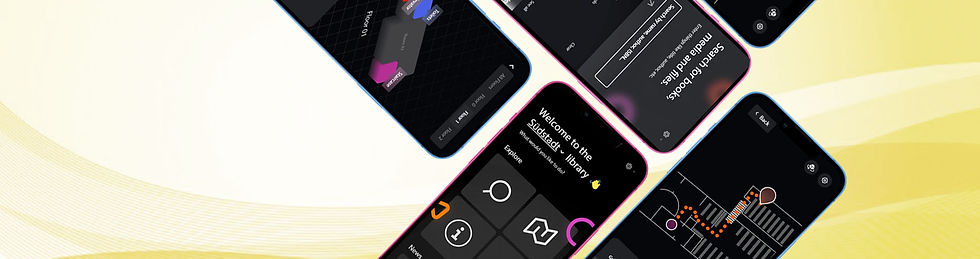
Home screen and side features

Useful information
(opening times, FAQs...)
Home screen
3D map
Resource searching...


Language display

Easier search through filters


Type in the name of your resource
All the information needed on the book
(printed or digital resource, campus availability, shelf number...)
... and book finding !

Just like on a regular mapping app, the user is shown an itinerary guiding him to the bookshelf of his choice. He can select a starting point from different pre-installed options
This mapping system is still a hypothetical one. The technology needed to locate a book within the library through the app would require RFID chips placed in the library books to have information about the book section the item is located in.
As of today, it's not the intention of the TH Köln library. In this case, students would therefore mainly rely on the 3D map to find their way around
Key learnings
Throughout this whole design process, I learned that:
-
it is important to keep the navigation and mapping systems as simple as possible to make them clear and instinctive.
-
when designing different language groups of users, it's better to keep the text to a minimum and focus on instinctive flows and strong visuals.
-
when correctly conceived, an app can be a truly empowering product for the user.
Next steps
In the future, we want to proceed with the following steps:
-
test and reiterate based on feedback
-
learn more about the possibilities of RFID technology within the library context
-
refine our current navigation feature to find a viable solution for the TH board
-
gather data about the increase in resource renting and map usage.